
Interactive climate maps and global warming visuals turn abstract climate data into something people can explore, compare, and understand in minutes. In the Education & Resources space, this hub page explains how interactive tools and calculators help students, teachers, journalists, planners, and concerned citizens make sense of rising temperatures, shifting rainfall, sea level rise, wildfire danger, and emissions trends. Interactive climate maps are digital interfaces that let users zoom, filter, layer, and animate environmental data across geography and time. Global warming visuals include charts, heat maps, anomaly maps, scenario graphics, carbon calculators, and risk dashboards that translate scientific measurements into plain-language insight. This matters because climate change is measured at multiple scales at once: global averages, regional extremes, local hazards, and household choices. Static reports remain essential, but I have repeatedly seen people grasp climate risk faster when they can click on their county, compare decades, or model emissions from travel and energy use. A strong climate visualization does more than look compelling. It connects trusted datasets, transparent methods, and practical interpretation so users can answer urgent questions: What is changing, where, how fast, and what does it mean for decisions today?
What Interactive Climate Maps Show and Why They Work
Interactive climate maps work because they combine spatial context with user control. Instead of reading a paragraph that says average temperatures are rising, a user can view annual temperature anomalies, switch between baseline periods, and watch warming intensify over time. The best tools layer multiple variables, such as temperature, precipitation, drought severity, flood exposure, population density, and infrastructure, so patterns become visible. For educators, this supports inquiry-based learning. For local governments, it supports risk screening. For businesses, it supports location-specific planning.
Most climate maps are built from established sources such as NASA, NOAA, Copernicus Climate Change Service, the IPCC, the U.S. Geological Survey, and national meteorological agencies. Under the surface, many rely on raster datasets, vector boundaries, georeferencing, interpolation, and time-series animation. Good interfaces expose enough methodology for trust without overwhelming nontechnical users. They also distinguish observed data from modeled projections. That distinction is critical. Observations describe what has already happened; projections estimate what could happen under different emissions pathways and assumptions. Confusing the two is one of the most common mistakes I see in classrooms and newsrooms.
Another reason these visuals work is cognitive efficiency. People understand change faster when they can compare before and after states, move a slider, or select their own location. A county-level heat risk map, for example, often has more impact than a national average because users can immediately connect the information to schools, roads, crops, insurance, and public health. The interactivity is not decoration. It is the mechanism that turns a large climate dataset into an answerable question.
Core Types of Global Warming Visuals and Calculators
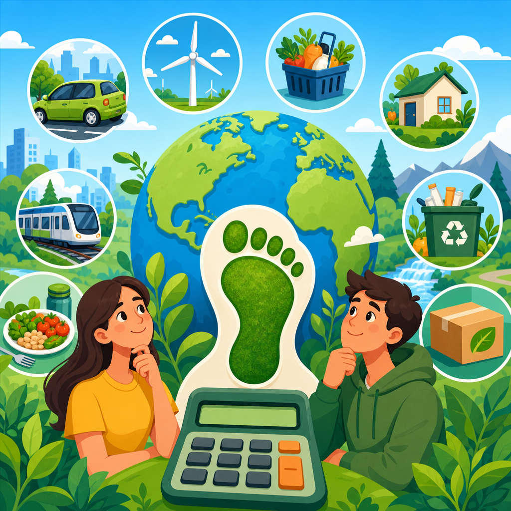
This subtopic includes several tool categories, and each serves a different user intent. Temperature anomaly maps show how far a location deviates from a historical average. Sea level rise viewers simulate shoreline changes under different rise scenarios and storm surge conditions. Emissions dashboards track carbon dioxide, methane, and sector-specific output from energy, transport, industry, agriculture, and land use. Carbon footprint calculators estimate emissions from household energy use, flights, commuting, diet, and consumption. Extreme weather visuals map heatwaves, drought, flood recurrence, hurricane exposure, and wildfire conditions. Climate projection explorers allow users to compare outcomes across future periods and emissions scenarios.
When I evaluate these tools, I look for five qualities: source transparency, scale clarity, scenario labeling, uncertainty communication, and ease of export or citation. A useful sea level rise map should identify whether elevation data come from lidar or coarser digital elevation models. A useful emissions calculator should disclose emissions factors, geographic assumptions, and whether it counts direct emissions only or broader lifecycle impacts. A useful wildfire dashboard should note update frequency, because real-time and historical products serve different decisions.
Users also need to know what a calculator can and cannot do. A household carbon calculator can estimate annual emissions ranges, but it cannot predict the full climate effect of every purchasing decision with precision. A flood map can indicate modeled inundation zones, but it does not replace parcel-level engineering analysis. The strongest global warming visuals set expectations early, then guide interpretation with notes, legends, and thresholds that make technical outputs meaningful.
Leading Interactive Tools and What They Are Best For
The climate tool ecosystem is broad, but several platforms are consistently reliable. NASA’s climate visualizations and Earth Observatory resources are strong for global temperature, ice, atmosphere, and long-term change. NOAA Climate.gov and related NOAA dashboards are strong for U.S. climate patterns, hazards, and educational explainers. The IPCC interactive atlas is one of the best resources for regional climate projections because it connects future scenarios with observed trends and confidence language used in assessment science. Copernicus provides high-quality European and global reanalysis products, especially for temperature, precipitation, soil moisture, and anomalies. Climate TRACE, Global Carbon Atlas, and Our World in Data are especially useful for emissions context and country comparisons.
For location-specific impacts, Climate Central has produced accessible coastal risk and heat tools that communicate public exposure clearly. FEMA flood resources, while focused on the United States and not climate-only products, are often paired with climate tools in planning workflows. Localized resilience portals created by cities and states can be excellent because they combine climate hazards with infrastructure and demographic layers. In practice, I often compare a global tool with a regional or local one to avoid scale mismatch. A global projection map may show broad warming, while a municipal heat vulnerability map reveals who is most exposed because of age, housing, tree cover, and surface materials.
| Tool type | Best use | Typical data source | Key caution |
|---|---|---|---|
| Temperature anomaly map | Showing observed warming over time | NASA, NOAA, Copernicus | Check baseline period before comparing maps |
| Sea level rise viewer | Exploring coastal exposure and inundation | NOAA, Climate Central | Vertical accuracy and local defenses matter |
| Carbon footprint calculator | Estimating household or travel emissions | Government factors, utility data | Results are estimates, not exact totals |
| Projection explorer | Comparing future climate scenarios | CMIP model ensembles, IPCC | Understand scenario assumptions and uncertainty |
If this page is your entry point into Interactive Tools and Calculators, think of these categories as your navigation system. Temperature tools answer what is changing. Risk maps answer where impacts concentrate. Calculators answer how choices influence emissions. Projection explorers answer what future conditions may look like under different pathways.
How to Read Climate Visuals Correctly
Reading climate visuals well requires more than spotting a dark red area on a map. Start with the legend. Color scales can represent absolute temperature, change from average, percentile ranking, or model agreement, and those are not interchangeable. Next, identify the timeframe. A map showing annual anomaly for one year tells a different story than a thirty-year climate normal or a 2050 projection. Then check the geography and resolution. A one-kilometer grid, a county average, and a national mean can each be valid, but they answer different questions.
Scenario labels matter just as much. Many future climate visuals rely on emissions pathways or socioeconomic scenarios. Users should not treat a high-emissions scenario as a prediction or a low-emissions scenario as a promise. They are structured assumptions used to test possible outcomes. Ensemble maps deserve careful reading too. If a projection shows a median outcome from many models, that is not the same as certainty. Spread, confidence intervals, and model agreement are signals of uncertainty that increase credibility rather than weaken it.
I also recommend checking whether a visual shows hazard alone or hazard plus vulnerability. Extreme heat exposure, for example, becomes far more useful when combined with age, income, health, tree canopy, and building characteristics. Without that context, a map may describe physical conditions but fail to explain actual risk. For learners, the best habit is to ask four questions every time: What variable is being shown? Compared with what baseline? Over what period? Based on observations or projections?
Using Interactive Tools in Education, Research, and Planning
As a hub within Education & Resources, this page should help readers move from curiosity to practical use. In classrooms, interactive climate maps support place-based learning. A teacher can ask students to compare local rainfall trends with global precipitation patterns, then connect the findings to agriculture, water management, or ecosystems. Students retain more when they investigate their own region instead of memorizing a global average. Carbon calculators are similarly effective when paired with reflection. Students can estimate emissions from transportation, then discuss which changes are realistic, high-impact, and constrained by cost or infrastructure.
In journalism and public communication, visuals help translate technical reports into evidence the public can verify. A reporter covering heat policy can use a city heat map, tree canopy layer, and census demographics to explain why some neighborhoods face higher exposure. In planning and resilience work, interactive tools guide screening and prioritization. Local agencies use them to identify roads at flood risk, cooling needs around schools, or emergency response gaps in wildfire zones. The most responsible teams do not stop at the map. They combine visualization with field knowledge, engineering studies, and community engagement.
Researchers use these tools differently. They may rely on interfaces for exploratory analysis, but they still return to raw datasets, metadata, and reproducible methods. That distinction matters for readers navigating this subtopic hub. Interactive tools are excellent entry points and communication devices. They are not substitutes for full methodological review when decisions involve permitting, insurance, or capital investment.
Common Pitfalls, Limits, and What to Look for Next
Even excellent global warming visuals can mislead if users overlook limitations. First, resolution can create false precision. A map may look highly detailed, yet underlying data may be coarse or interpolated. Second, recency can be misunderstood. Some dashboards update daily, while others rely on multi-year data processing cycles. Third, comparability is often weaker than users assume. Switching between products from different organizations can introduce different baselines, model ensembles, thresholds, and definitions. A drought map based on soil moisture is not directly equivalent to one based on precipitation deficit.
Accessibility is another issue. Strong tools provide mobile usability, alt text, readable legends, and clear language. Weak tools bury assumptions in technical appendices or require specialized knowledge just to operate the interface. Trust also depends on governance. Prefer tools maintained by scientific agencies, universities, established nonprofits, or clearly documented research collaborations. If a map lacks methodology, citation, update history, or contact information, treat it cautiously.
As this hub expands, readers should explore deeper articles on sea level rise viewers, carbon footprint calculators, wildfire risk maps, extreme heat dashboards, emissions trackers, and climate projection atlases. Those pages can cover tool-by-tool reviews, teaching ideas, and selection criteria in more detail. The main benefit of interactive climate maps and global warming visuals is simple: they make complex climate evidence usable. When built on sound data and read carefully, they help people ask better questions, compare credible scenarios, and make more informed choices. Use this hub as your starting point, then dive into the specific interactive tools and calculators that match your goals.
Frequently Asked Questions
What are interactive climate maps, and why are they useful for understanding global warming?
Interactive climate maps are digital tools that turn large sets of environmental data into visual, clickable experiences. Instead of reading static charts or long technical reports, users can zoom into a region, compare time periods, switch between indicators, and see how climate conditions vary from place to place. These maps often display trends such as rising temperatures, changes in rainfall, drought severity, sea level rise, wildfire danger, carbon emissions, and extreme weather risk. The interactive format makes climate information more immediate and easier to interpret, especially for people who are not climate scientists.
They are especially useful because global warming can feel abstract when it is described only in averages or broad global statistics. A map shows where changes are happening, how quickly they are unfolding, and which communities or ecosystems may be most affected. For teachers and students, that makes climate learning more concrete. For journalists, it creates a clearer way to explain local relevance. For planners and decision-makers, it helps connect data to infrastructure, water supply, land use, and emergency preparedness. In short, interactive climate maps help people move from passive awareness to active understanding by making climate change visible, local, and easier to explore.
What kinds of climate data do global warming visuals usually include?
Global warming visuals can cover a wide range of indicators, depending on the purpose of the tool. Common layers include surface temperature trends, heat waves, precipitation changes, snow and ice loss, drought conditions, sea level rise projections, ocean warming, hurricane or storm risk, wildfire weather, air quality impacts, and greenhouse gas emissions. Some tools focus on historical observations, while others emphasize future projections based on different emissions scenarios. More advanced visuals may also include population exposure, infrastructure vulnerability, crop impacts, flood zones, or health-related risks such as extreme heat exposure.
What makes these visuals powerful is that they often allow users to compare multiple variables in one place. For example, someone might look at annual temperature anomalies and then switch to rainfall or fire danger to understand how several climate pressures interact. Many tools also offer time sliders, side-by-side comparisons, downloadable charts, and location search functions. This combination of scientific data and intuitive design helps users understand not just what is changing, but how different climate factors connect across regions and over time. When built well, these visuals translate complex datasets into a format that supports learning, reporting, and practical planning.
How accurate are interactive climate maps and climate change calculators?
The accuracy of an interactive climate map or calculator depends on the quality of its data sources, the methods used to process that data, and how clearly the results are explained. The strongest tools rely on trusted sources such as government agencies, academic institutions, international climate datasets, and peer-reviewed research. They typically document where the data comes from, how often it is updated, what geographic resolution it uses, and whether the results reflect historical measurements, model projections, or estimated risk. When that transparency is present, users can have much more confidence in what they are seeing.
That said, climate visuals should be understood as interpretive tools, not crystal balls. Future projections involve scenarios, assumptions, and ranges of uncertainty. A sea level rise map, for example, may show different outcomes depending on emissions pathways, local land elevation, storm surge assumptions, or the time horizon selected. A calculator may estimate emissions or exposure based on standardized inputs rather than every local condition. That does not make the tool unreliable; it means the results should be read in context. The best practice is to use interactive climate visuals as a strong starting point for insight, then review the source notes, methodology, and uncertainty ranges before making high-stakes decisions based on the output.
Who can benefit most from using interactive climate maps and visual tools?
Interactive climate maps are useful for a broad audience because they make complex scientific information easier to explore without oversimplifying it. Students and teachers can use them to support lessons on weather, climate systems, environmental change, and public policy. Journalists can use them to explain local impacts and add context to stories about heat, drought, storms, flooding, or emissions. City planners, emergency managers, architects, and infrastructure teams can use them to assess risks tied to heat stress, stormwater, sea level rise, and wildfire exposure. Even community organizations and individual residents can use these tools to better understand what climate trends may mean for their neighborhoods.
One of their biggest strengths is accessibility across different levels of expertise. A beginner may use a map to answer simple questions such as whether a region is getting hotter or wetter. A more advanced user may compare scenarios, evaluate long-term patterns, or analyze risk layers in relation to housing, land use, or transportation. Because the tools are visual and interactive, they reduce the barrier to entry while still offering depth for people who need it. That makes them valuable in education, communication, policy, planning, and public engagement, especially when climate information needs to be both scientifically grounded and easy to grasp.
How should readers use climate visuals responsibly when interpreting local climate change impacts?
Readers should begin by understanding exactly what a visual is showing. That means checking whether the map displays historical observations, short-term forecasts, long-range projections, or modeled scenarios. It is also important to note the time frame, unit of measurement, geographic scale, and any assumptions built into the display. A map that shows county-level average heat trends may be useful for broad interpretation, but it may not capture neighborhood-level differences such as urban heat islands, elevation changes, or local drainage issues. Reading the legend, metadata, and methodology is essential if the goal is to draw accurate conclusions.
Responsible use also means avoiding overinterpretation. Climate visuals are excellent for identifying patterns, risks, and areas that deserve closer attention, but they are usually one part of a larger decision-making process. For local planning, reporting, or educational use, it is wise to pair map insights with local expertise, official risk assessments, and recent on-the-ground observations. Comparing multiple reputable tools can also help reveal whether a trend is well supported across datasets. When used this way, interactive climate maps become more than just compelling graphics. They become practical resources for understanding climate change clearly, communicating it responsibly, and making better-informed choices in response to a warming world.